As seen in

,i can’t fit this post thing (or stretch) it to the gray area.
my project is: bony-turkiye
I tried many things with CSS but couldn’t fix it.
Any help?
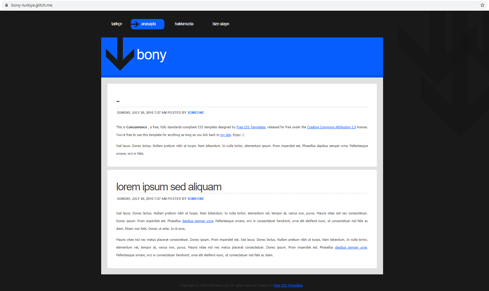
As seen in
Hi Pepsi Man,
I went on your site, it looks a little different from the screenshot as there was a sidebar there, but I did modify it to look more like you want.
First I have to say, this is quite an old-school template, we wouldn’t do web design like this anymore, and I’d recommend trying a more modern template like something from https://html5up.net/
Anyway, the main problem is that the white arrows image is only 620px wider. So even if we make the container bigger, the arrows will still look wrong.
Here’s what I would do (after you remove the sidebar):
#content, remove the width: 620px rule (you can actually remove all the CSS for #content).post-bgtop to:.post-bgtop {
background: white;
margin: 1em;
}
.post-bgbtm remove the background ruleBut again, this site design is not responsive for mobile/tablet and there are better ones out there for free 
Edit: Here’s an image:
Hope this helps.
Ste
This topic was automatically closed 180 days after the last reply. New replies are no longer allowed.